Wednesday, 30 November 2011
Branding Mock Up Ideas Continued...
Continuing with my idea, taken photos of background with a clearer sky. Leaving one cloud to cover up the tabs and make my origami logo stand out in perspective. I have included a skyline of images i have taken also myself to show that it is Wolverhampton I am promoting and not just anywhere.
Wednesday, 23 November 2011
Adjusting Layouts
Adjusting my page layouts to size and looking at the columns in my designs further. Making some changes to text and some illustrator additions with the graffiti effect.
Monday, 21 November 2011
Mailer Developing
I have decided to go a completely different route, although still keeping my 'W' fold out pop up. As my original logo design was origami I wanted to feature this in my mailer so when I did the W in the middle of some card my feedback was suggested it looked like a bird when flying, so the tutors told me to base my W and look at details of money as my theme to this logo was progression in the economy. This is what I have came up with so far...
Saturday, 19 November 2011
Branding Mock up Moquettes
Some mock up moquettes I made as development for my branding mailer design. Just experimenting with simple shapes and forms, seeing how they fold and form together.
Branding - design development to Mailer
My idea for my Branding Mailer, some research and folder work I have undergone. I would like my mailer to fit into an A4 size envelope and having a pop up mechanism in the middle of the design. This would be my logo I created in the earlier brief as my original idea to my logo was origami. My feedback given was to maybe create this pop up 'W' letterform and maybe look into the details of money on paper notes to suggest the message of 'progression through the economy' in Wolverhampton as this is my whole theme of the subject. So I will develop this further.
Wednesday, 16 November 2011
Layout Developing
Some more of my layouts continued to develop inserting more text. I have added in a front cover to my designs also. I have tried experimenting with whole colour filling in a page. For the solution I have removed the backgrounds and edited them with colour blends using photoshop to get that added effect.
Saturday, 12 November 2011
Microsite Homepage Design
Edited photography of an idea of how my microsite homepage could look. By clicking over the greyscale graffiti and spraying over the sections to the different parts of the site.
Monday, 7 November 2011
Protectyourhead Microsite
When researching I came across this microsite which had great relevance to how I'd like to base my design around. I feel this engages with the audience well by informing and entertaining using the activities.
http://protectyourhead.com/
http://protectyourhead.com/
Editorial DPS
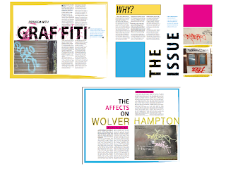
These are my double page spreads for my Issue which is Graffiti in Wolverhampton. I have tried using colour and adding more marks into the typography. I will keep on improving though.
These are the second half of my double page spreads which is the solution to the problem. I have tried using clearer marks and use of colour yet again to distinguish the series. Again I will keep improving
Subscribe to:
Comments (Atom)


