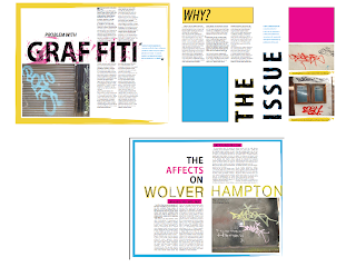
These are my double page spreads for my Issue which is Graffiti in Wolverhampton. I have tried using colour and adding more marks into the typography. I will keep on improving though.
These are the second half of my double page spreads which is the solution to the problem. I have tried using clearer marks and use of colour yet again to distinguish the series. Again I will keep improving


Perhaps try to make more of the dynamic imagery in terms of cut outs and use of scale. Also remember that you might make more of the background image or texture.
ReplyDeletePerhaps also look at the use of space and white colour/page
hey, i came across this image earlier
ReplyDeletehttp://lestaret.files.wordpress.com/2010/11/lethem.gif
thought it looked like the graffiti dps's your doing, could use it as research or something :)
Thanks for that :)
ReplyDelete