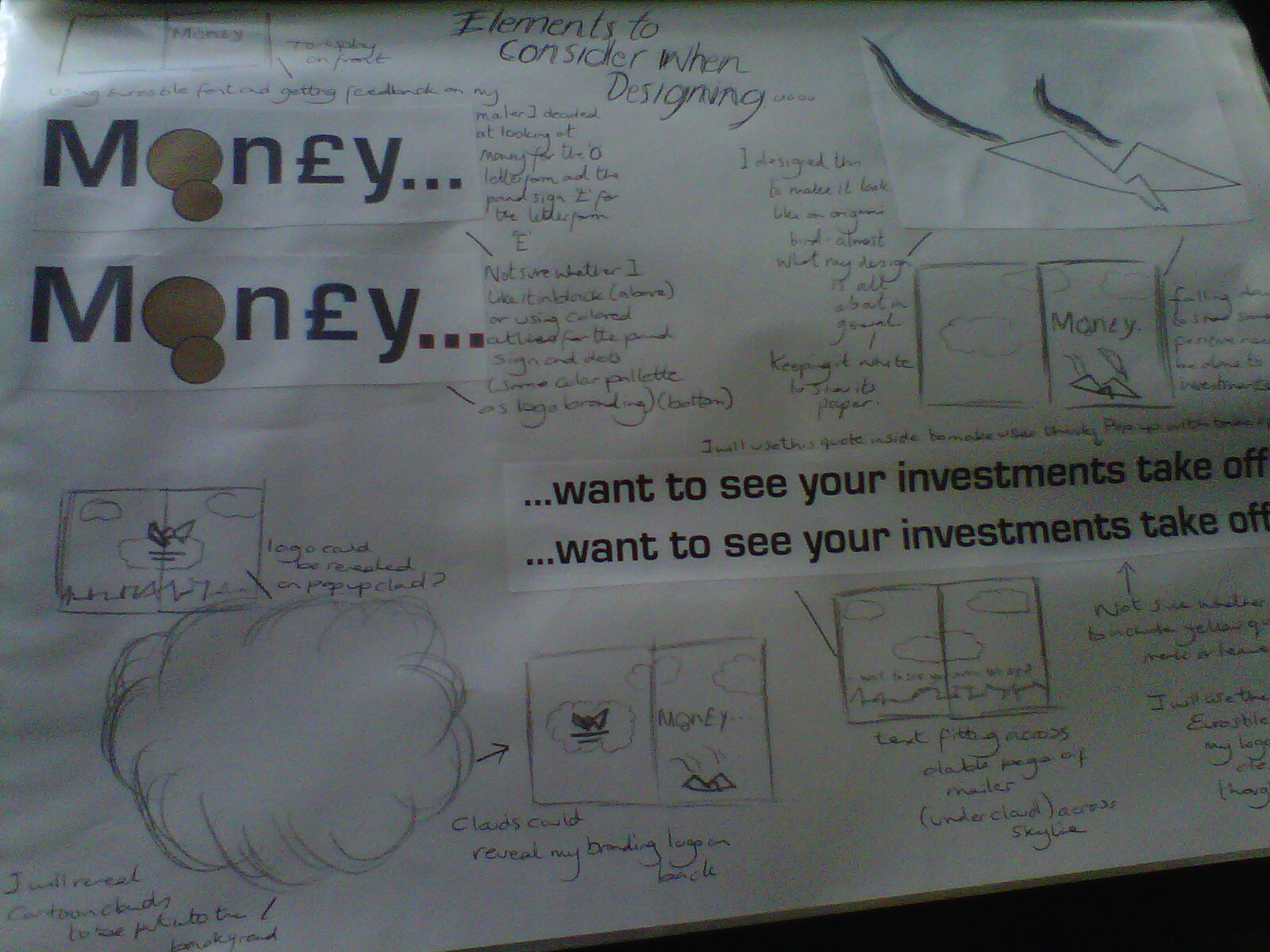
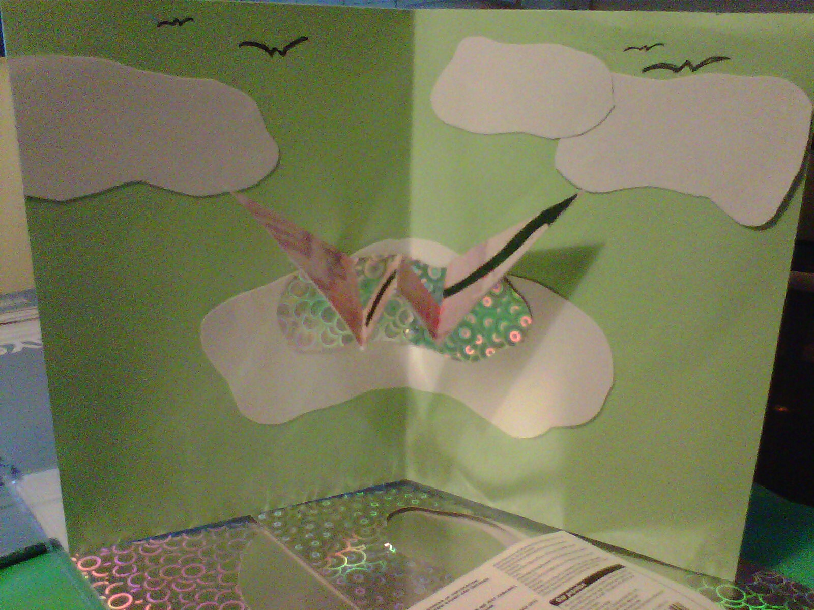
My final mailer designed. I have made more changes especially to the design on the front of the mailer, using typography and coins to show the meaning of how I want to persuade my target audience. I believe my design would encourage investors to visit Wolverhampton, my logo fits in well with my related design of the origami money bird. 'Taking off' suggests this. The skyline is meant to show that its in Wolverhampton itself.
Showing posts with label Branding. Show all posts
Monday, 9 January 2012
Wednesday, 7 December 2011
Mailer Design Continued
My mailer design development in folder work and marquette. I have continued along the same idea but changed the look of my background. Adding in details of cartoon like clouds and skyline of Wolverhampton. I have also came up with a design for the front and back cover, focusing on typography I will use.
Wednesday, 30 November 2011
Branding Mock Up Ideas Continued...
Continuing with my idea, taken photos of background with a clearer sky. Leaving one cloud to cover up the tabs and make my origami logo stand out in perspective. I have included a skyline of images i have taken also myself to show that it is Wolverhampton I am promoting and not just anywhere.
Monday, 21 November 2011
Mailer Developing
I have decided to go a completely different route, although still keeping my 'W' fold out pop up. As my original logo design was origami I wanted to feature this in my mailer so when I did the W in the middle of some card my feedback was suggested it looked like a bird when flying, so the tutors told me to base my W and look at details of money as my theme to this logo was progression in the economy. This is what I have came up with so far...
Saturday, 19 November 2011
Branding Mock up Moquettes
Some mock up moquettes I made as development for my branding mailer design. Just experimenting with simple shapes and forms, seeing how they fold and form together.
Branding - design development to Mailer
My idea for my Branding Mailer, some research and folder work I have undergone. I would like my mailer to fit into an A4 size envelope and having a pop up mechanism in the middle of the design. This would be my logo I created in the earlier brief as my original idea to my logo was origami. My feedback given was to maybe create this pop up 'W' letterform and maybe look into the details of money on paper notes to suggest the message of 'progression through the economy' in Wolverhampton as this is my whole theme of the subject. So I will develop this further.
Sunday, 23 October 2011
Pop Up Tutorial
I found this simple pop up tutorial online, looking how to do simple folds and how they are attached. Thought this would help influence how I'll decide to go about my design.
Sunday, 16 October 2011
My Final Logo Development
I have decided to go through with my origami design. I wanted to show a progressive flexible economy on my branding for The City of Wolverhampton. The picture above is development of a 3D origami 'W' letterform in which this shows the flexible in the strapline. The arrow is to state progression within the economy in how Wolverhampton is advancing itself. I did many drawings on size of type and typography I might use and came to a conclusion on either of the bottom ideas. I chose this colour palette as its bright and can show positive values. I think personally I like either of the above 2 designs.
Wednesday, 12 October 2011
Branding - design development
Linking my research and my ideas together. These were some of the designs I came up with for the brief, which was to design a new brand logo and animate for the city of Wolverhampton. I am happy with some of the ones I have developed as I was struggling at first but now feel I know which one concept I will follow to continue with.
Subscribe to:
Posts (Atom)